Direct Clicks
05
Direct Clicks
2025

From Passive to Precise: The Direct Clicks Rebrand
The Challenge (The "Before" State)
"Soft Shapes in a Sharp Industry." Looking at the previous identity, it was clear that it was a product of an earlier internet era.
The old logo featured rounded, lowercase initials confined within a heavy circle. While friendly, this "soft" aesthetic felt passive and lacked authority. It did not communicate the aggressive growth strategies and precision targeting that modern businesses demand from a top-tier agency today.
The challenge was to evolve the brand from feeling like a small, local outfit to a versatile, enterprise-ready industry leader, without losing the core "DC" recognition.
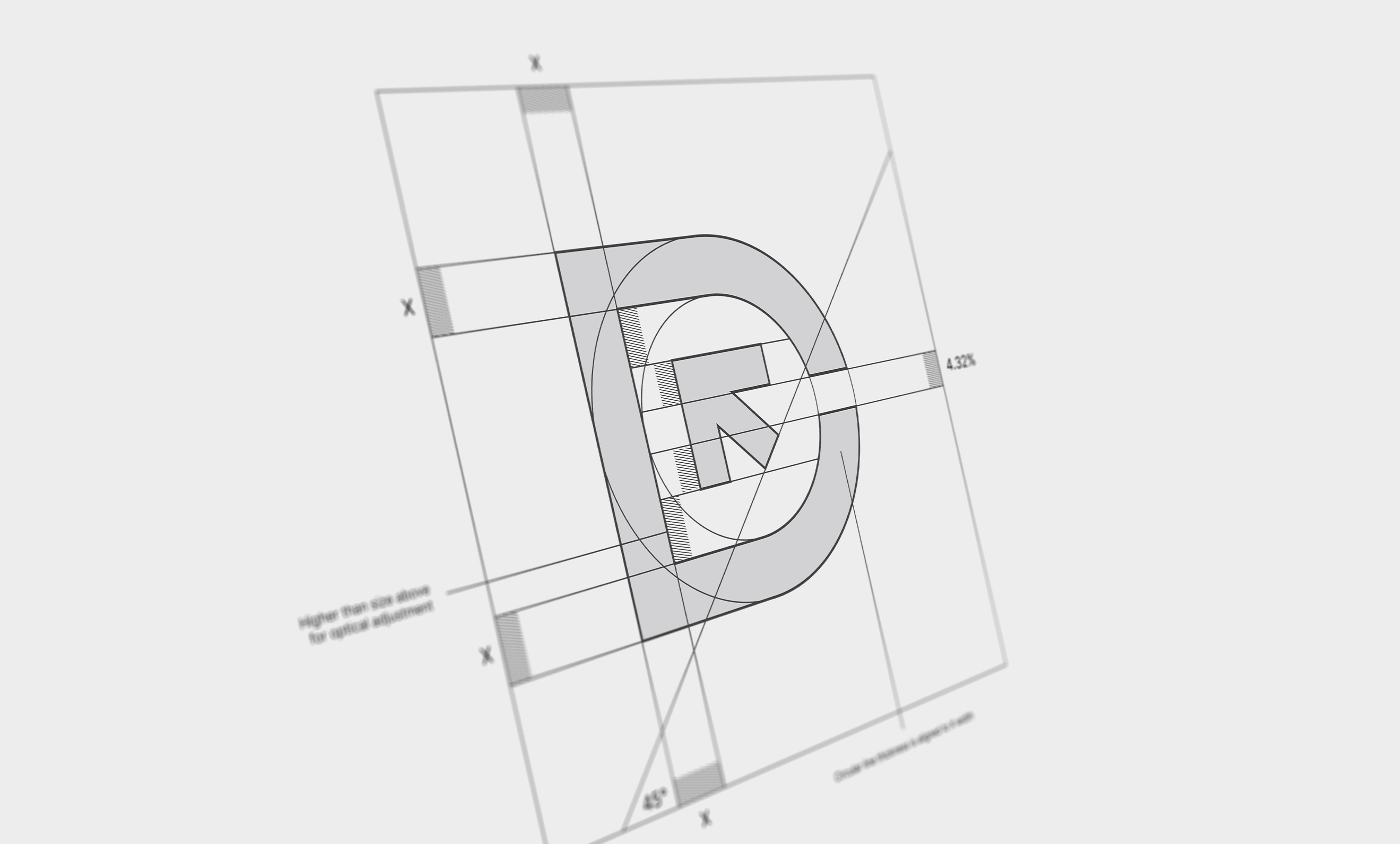
The Solution (The Core Concept)
Concept: Focus & Precision We needed to trade softness for strength. The new identity is built on a foundation of bold geometry and assertive architecture.
We moved away from the enclosed circle and lowercase letters to create a mark that stands on its own. The resulting logo is not just a monogram; it’s a functional tool. It is sharp, legible across all devices, and built for a digital-first world.
Client:
Direct Clicks
Date:
2025
Role: